

Causal analysis with the causalimpact package in R
In this tutorial we'll cover the theory behind the causalimpact package in R and how detecting cause and effect differs from looking at correlations. We'll use real life data to show the impact that a competitor opening had on store sales.

Contents
Causation not correlation
When we analyse business data, a common goal is to understand if a specific action or event caused a change in our key metrics. For instance, did a competitor opening nearby actually harm our sales or was the subsequent dip just a coincidence? Did the coupon we sent cause an uptick in sales or did it just coincide with the holiday period? In data science it's common to hear the expression "correlation doesn't imply causation" as whilst correlation tells us that two things tend to move together, it doesn't prove that one causes the other (as the chart below starkly illustrates!).

We might see that our store's sales dropped after a competitor opened but this doesn't automatically mean the competitor was the cause; perhaps sales were already declining due to seasonal trends, a local economic downturn or other unobserved factors. Working out the answer to problems like these takes us into the realm of causal inference.
To establish causation, we must answer a much harder, hypothetical question: what would have happened to our store's sales if the competitor had never opened at all? This "what if" scenario is what we call the counterfactual. The concept of the counterfactual is the cornerstone of the CausalImpact package. Since we cannot observe a parallel universe where the competitor never opened, we must construct this counterfactual scenario using statistical modelling. The package achieves this using a sophisticated technique called a Bayesian structural time-series (BSTS) model.
Imagine we have a "target" store (the one we're interested in) and a group of "control" stores. These control stores should be similar to our target but not affected by the event (i.e. the new competitor). The model carefully observes the relationship between the target and control stores during a "pre-intervention" period—a baseline period before the event occurred. For example, it might learn that our target store's sales are typically 1.2 times the sales of Store A plus 0.8 times the sales of Store B, minus a bit for local holidays.
Once the model has learned this stable relationship, it uses the behaviour of the control stores during the "post-intervention" period to predict what the target store's sales would have been. This prediction is our synthetic, data-driven counterfactual. The difference between this predicted path and the sales that were actually observed is then attributed as the causal impact of the event. Because the model is Bayesian, it also quantifies our uncertainty at every step, giving us a credible range for the final effect. Obviously as we never got to observe the counterfactual directly we can't know that the event caused the outcome but this allows us to make a best guess and quantify the uncertainty surrounding the estimation of the impact.
Prepping our data from kaggle
We'll walk through the entire process using a real-world example from a Kaggle competition concerning the Rossmann drug store chain. Our goal is to measure the impact on a store's sales after a new competitor opened nearby. We'll use the 'store' data set that contains information about the individual stores, including which year and month competitors opened and also the 'train' data which has the daily sales of each store.
We'll load the tidyverse package which contains dplyr and ggplot2 for wrangling and plotting our data, CausalImpact for the model as well as lubridate for help working with the date values.
To run a successful causal impact experiment we need one target store that was affected by an intervention and a pool of control stores that were not. In the 'stores' dataset there's a variable called 'CompetitionOpenSinceYear' that tells us when a nearby competitor opened. The train data runs from 1st Jan 2013 to July 2015 so let's pick a store that had a competitor open in 2014 so we have a decent sized pre and post period to work with. We can filter for stores that had a competitor open in 2014 and also sort on the 'CompetitionDistance' column to find those that had a competitor open up close by on the basis that this should have had a bigger impact.
It looks like we've got a couple of stores that had competitors open up close by. I'm going to pick store 905 since it had a competitor open up but also didn't seem to run any kind of promotion in response so we should get a clearer signal on the impact of the competitor. We can plot the daily sales of the store to see if it looks like the competitor opening had an impact. As daily sales data can be noisy, we'll add a smoothed trendline to the plot.
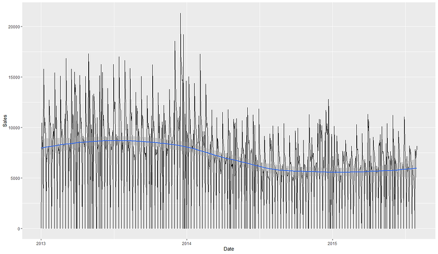
So it looks like the sales from 2014 onwards might have already been on a bit of a downwards trajectory before the competitor opened in June. It does look like there could be a larger drop around that time before the sales plateau/stabilise at the new lower rate.
Finding Control stores
Now we've chosen our target store to investigate, 905, we need to create a pool of potential control stores. The most critical rule for a control is that it must not have been affected by the same intervention i.e. the specific competitor to 905 opening. Since we don't know how close the stores are to each other and whether the competitor could have affected those too, we'll filter our list of stores to include only our target (905) and any store that didn't have a competitor open in 2014.
The strength of our analysis depends entirely on the quality of our control stores. One way to identify possible controls would be to use the features of the store e.g. when it opened, the size of the assortment or the store type. However, whilst this would give us groups of stores with similar attributes, what we're really interested in for our model is stores with similar sales patterns.
We need to find stores that behaved very similarly to our target store before the competitor arrived. A robust way to do this is with correlation analysis. First, we'll calculate the correlation between Store 905's sales and all other potential control stores' sales during a clean pre-intervention period. We'll use all of 2013 and the first 5 months of 2014 to do this.
Next we can take our long-form daily sales data and pivot it into a wide form where every column is a store and every row a specific day. From here we can treat each store as a separate feature and calculate the correlation in sales over the time period between our target store and all the possible control stores.
We can see that the top 5 stores with the highest absolute correlations are 131, 615, 170, 157 and 269. I used the absolute correlation as it doesn't matter for our model if the correlation is positive or negative between our target and control series, only that they typically move together. The correlations are actually extremely high which means we should be able to construct very good controls which will help us detect the causal effect of the competitor opening (if there is one).
Seeing that we have strongly correlated trends across the whole period is useful but a single correlation value over the whole period can be misleading. A relationship might appear strong overall but could be driven by a short, anomalous period. A more robust method is to use windowed correlation, where we check if the relationship remains stable over time. Think of it as a bit like doing k-fold cross-validation for a supervised machine learning model. Instead of measuring performance once, we split our data into separate chunks, calculate the statistic and then average the results to get a more robust final measurement. We'll calculate the correlations on a quarterly basis and select controls that are on average, consistently highly correlated with our target.
We can see that the top store is now 729 and that the previous top store 131 is actually now in 6th place. This approach is helpful as not only does it allow us to find controls that consistently correlate well with our target series but we can also plot the variance in the correlation between our target and control in different periods. This hopefully minimises the chance of picking a spuriously correlated time series for our model. Let's create some boxplots on the correlations observed for our top stores for each of the quarters to see how much they vary.

So this looks pretty consistent. We can see that the lowest correlation any of the top 5 stores got in a quarter was ~0.93 which is still very high. Store 341 looks to have the most consistently high correlation but all of these look like good candidates for our model.
Data prep for Causalimpact
Now we've calculated which stores have a strong correlation to our target using the robust windowing approach, we can define our list of control stores for our model. We'll use all the stores with an average, absolute quarterly correlation of at least 0.75. This is a useful screening rule, though domain knowledge about store types and locations could further refine this process.
Now we've defined our target and control time series we can construct our final data set for causal impact. The CausalImpact package is quite picky about how it likes its data to be formatted:
-
The data must be a time-series object like xts or zoo (we'll see how to create this later).
-
The first column must be our target time series (which in our case is the weekly sales data for Store 905).
-
The subsequent columns must be our control time series
-
There can be no missing values (NA) at all.
The following code transforms our data to meet these requirements. First we create two filter objects, one for our target store and one for our control. These are just vectors of store numbers with "Store_" prefixed to them. This is because that's how our pivot_wider transformation will name them.
The main bulk of the data manipulation is done in the code that creates the time_series_data object. This takes our train data, which has a row per day and per store, and pivots it into a wide format with a day per row and a store per column. The row value is then the sales for that store on that day. We filter to only keep our target and control store sales and replace any missing values with 0s.
Now we've got our data in a wide format with our target store as the first column (apart from Date) we can convert it into the xts object that causalimpact likes to work with. We take our time series data and remove the Date column so our target column 'Store_905' will be the first column we pass in. We then add back in the Date separately from our table with the 'order.by= '
Identifying seasonality
Our data set is all prepped and ready to pass to causal impact. However before we do, it's good to run a check to see if it shows any seasonal patterns that we can warn causal impact about. When we run a causal impact analysis it is important to check whether the data exhibits seasonal patterns. Seasonality means the series tends to rise and fall in a regular cycle, such as weekly or yearly rhythms. If we ignore it, the model may wrongly attribute predictable ups and downs to the intervention itself. For example, if sales always drop on Sundays, the model might mistake those routine dips for an effect of a competitor’s opening unless we account for that structure. The CausalImpact package allows us to specify seasonal components, so being able to diagnose them up front is very useful.
A simple tool for detecting seasonality is the autocorrelation function (ACF). The ACF measures how correlated a time series is with lagged versions of itself. If the value at time t tends to predict the value at t−k, we will see a spike in the ACF at lag k. By plotting the ACF across many lags we can see whether there are repeating peaks at regular intervals. Such peaks are the hallmark of seasonality. Essentially, what ACF does is see if the time series explores the same area on a regularly recurring basis. For example, if this Monday's sales correlate well with last Monday's sales and the Monday before that and the Monday before that, then it 'd look like there is a weekly seasonality to our data. Let's have a look at our target trend again to see if it looks seasonal.

One of the challenges working with daily data is it can be hard to spot patterns in it. There definitely seem to be recurring peaks and troughs which could suggest short term seasonal behaviour. Thankfully we can use R's inbuilt acf() function to spot the seasonality for us. First we'll run it on some completely random data to see what a time series without a seasonal component looks like. We do this using the acf() function. The lag.max option allows us to tell acf how many different lag values to try e.g. is there a correlation between the data point and itself at -1 day or -2 days all the way up to -35 days in our example.


The second chart shows the acf plot for our dummy, random time series. All the bars (other than lag 0) fall within the blue dashed confidence bands. This tells us there is no statistically significant autocorrelation at any lag, and therefore no evidence of periodicity. This is what we would expect from purely random noise. The correlation is always 1 at lag 0 as that is comparing the data point against itself. Let's now try running acf on our actual sales data.

Here we do see clear spikes outside the blue bands at lags such as 7, 14, 21, and 28. These are all exact multiples of a week, which tells us the series has a weekly seasonal pattern i.e. sales this Monday are correlated with sales last Monday, and so on. This makes sense for retail, where footfall and purchasing often follow a weekly rhythm.
If the ACF spiked strongly at lag 7 but not at 14, 21 or other multiples of 7, what we'd be seeing is a single-step correlation rather than a persistent seasonal cycle. In other words, today’s sales are correlated with sales exactly 7 days ago, but that similarity does not carry forward two or three weeks out.
Taken together, the charts confirm that Store 905’s data is not random noise and does contain seasonal autocorrelation at a weekly frequency. For causal impact modelling this has two implications. First, when we specify the model we should consider including a seasonal component (e.g. a weekly cycle if using daily data) so that the counterfactual captures routine ups and downs correctly. Secondly, we should make sure our control stores show similar seasonality, otherwise the model might not be able to separate intervention effects from the natural cycle. By diagnosing seasonality with the ACF before running the model we strengthen the validity of the causal conclusions.
Running Causal Impact
Now we've got our time series object and identified the weekly seasonality in our data, we're ready to run our model. Let's quickly recap how causalimpact works and then we can see it in action. CausalImpact uses a Bayesian structural time-series model to estimate what would have happened to a treated unit (e.g., a store) if the intervention had not occurred.This framework is powerful because it explicitly accounts for both trend and seasonality, while integrating uncertainty into the effect estimates. It does this by building a counterfactual prediction based on the pre-period relationship between the treated store and a set of control series.
The model training and prediction process takes the following steps, highlighting the key assumptions of the model, namely that the pre-period relationship holds in the post-period (barring the intervention) and that the controls are unaffected by the intervention.
-
Step 1 – Learn the mapping: During the pre-intervention period, the model learns how the target store’s sales move in relation to the controls. If the controls are good, they act like a fingerprint of the target’s “normal” behaviour.
-
Step 2 – Project forward: In the post-period, the model projects what the target’s sales would have been if no intervention happened, using the controls and the learned mapping.
-
Step 3 – Compare reality vs. counterfactual: The observed sales are compared against this synthetic forecast. The gap between the two is attributed to the intervention.
-
Step 4 – Quantify uncertainty: Rather than a single number, the model produces a distribution of possible counterfactuals, yielding credible intervals for the estimated effect.
The below code first defines our pre_period and post_period. The pre-period is the start of our control time period where the model learns the relationship between our time series before the intervention occured. It uses this to build up a picture of what should happen during the post period. The post_period define when the intervention started. Esentially, the pre-period teaches the model; the post-period is where effects are measured.
We also have the option to tell causalimpact about any seasonal features in our data. The nseasons = 7 tells causal impact there is weekly seasonality in our data (7 days per cycle) and the 'season.duration = 1' tells the model it is measured at a daily granularity. The 'niter = 5000' isn't strictly necessary but defines the number of MCMC draws. The more iterations, the more stable the posterior should be but at the expense of a longer runtime. After fitting, the standard workflow is:
-
plot(impact) → visualizes observed vs. predicted counterfactual.
-
summary(impact) → quick statistical readout.
-
summary(impact, "report") → narrative report with interpretation.
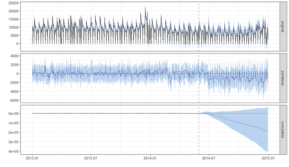
The chart is divided into three main panels, each telling a different part of the story. The top panel shows the actual, raw sales data. The solid black line represents the sales of the target store, while the dashed blue line represents a "counterfactual" prediction—what the sales would have been if the intervention had never happened. The shaded blue area around the dashed line is the 95% confidence interval for that prediction. The vertical dashed line marks the start of the intervention period. Before the dashed line, you can see how well the model's prediction (dashed blue line) fits the actual data (solid black line). This builds confidence in the model. After the dashed line, you can visually compare the actual sales to the model's prediction to see the initial impact of the intervention i.e. if the model was accurate in its predictions in the pre period but not in the post that suggests the intervention genuinely changed something that broke with the previous state of affairs learnt by the model.
The middle panel shows the difference between the actual sales and the predicted counterfactual sales for each individual day in the post-intervention period. The solid black line represents the estimated causal effect on a daily basis. The shaded blue area is the 95% confidence interval for this effect. If the solid black line and the shaded area are consistently below the zero line, it indicates a negative causal effect. If they are consistently above the zero line, it indicates a positive effect. If the shaded area crosses the zero line, the effect is not statistically significant for that specific day. For our data we can see that the effect is generally negative (below the horizontal zero line) but also highly variable, with the 95% confidence interval (shaded blue area) consistently including zero. This indicates that while there's a visible drop, the effect at any single point in time is not statistically significant.
The bottom panel shows the cumulative effect of the intervention over the entire post-intervention period. It's essentially the running total of the values from the "Pointwise" plot. The solid black line shows the total causal effect, and the shaded blue area represents the 95% confidence interval for this cumulative effect. This is often the most important plot for a business. The downward sloping blue line and shaded confidence interval show a growing cumulative negative effect. However, the 95% confidence interval (shaded blue) includes the zero horizontal line for most of the post-intervention period.
The statistical significance for the cumulative effect is determined by whether the confidence interval at the very end of the period includes zero which in our case it does. Notice also that as we get further from the intervention date the model naturally becomes less certain about the effect of the impact. This makes sense as time goes by there could be other factors unaccounted for that could be driving the change. In our case, the first few flat days probably means the competitor didn't open until a few days into June since we had to guess at the date due to only having the month they opened.
We can get a more quantitative summary of the results by calling summary() on our fitted model.
This tells us that during the post-intervention period, the average value of the store's sales was around 5,921. However, without the intervention, the model predicted an average of 6,781, with a 95% confidence interval of [5,601, 7,841]. This suggests the intervention caused an average decrease of 860, although the 95% confidence interval for this effect is wide, ranging from a decrease of 1,920 to an increase of 320. This means we can't be certain the effect was negative.
Over the entire period after the intervention, the total outcome value was about 1.27 million. The model estimated that without the intervention, the cumulative value would have been roughly 1.45 million. This resulted in a total shortfall of around 184,138. In percentage terms, this represents a 12% decrease. However, the 95% confidence interval for this percentage ranges from a 24% decrease to a 5.7% increase, which means the effect isn't statistically significant. The probability of this outcome happening by chance is 6.8%, which is too high to confidently say that the intervention was the cause.
We can even get causal impact to do the interpreting for us by asking for the summary report.
During the post-intervention period, the store averaged about 5,920 units sold per day. If no intervention had occurred, we would have expected daily sales closer to 6,780 units, with a reasonable range between 5,600 and 7,840 units. This suggests a shortfall of roughly 860 units per day. However, because the confidence range also includes zero (from about −1,920 to +320 units), we cannot be sure the effect is real.
Looking at the totals across the full post-period, the store sold around 1.27 million units, while the counterfactual suggests it would have sold about 1.45 million units. That implies a total loss of about 180,000 units, though again the credible range is wide (between 1.20M and 1.68M units expected), so the evidence is not conclusive.
In relative terms, sales fell by around 12% compared to expectations, but the plausible range spans from a 24% drop to a 6% gain. This wide interval means that, statistically, we cannot rule out the possibility that the intervention had no effect at all. The model estimates the probability that the observed decline was simply due to chance at about 6.8% (p = 0.068). While this is suggestive of a negative impact, it does not meet the usual threshold for statistical significance.
In CausalImpact, the 6.8% is the posterior tail-area probability (the Bayesian analogue of a p-value). It represents the probability of seeing an effect at least as extreme as the one observed if, in reality, the intervention had no impact. A value of 0.068 means there’s about a 6.8% chance that the apparent decline could simply be explained by random noise rather than a true causal effect. By convention, we often use a 5% cut-off (p < 0.05) as the threshold for calling an effect “statistically significant.” Since 0.068 > 0.05, this result falls into a “borderline” or “weak evidence” zone. Put simply, the evidence leans towards a real negative impact, but it’s not strong enough to rule out chance as a likely explanation. The analysis suggests a possible sales decline of around 12%, but with a 6.8% probability that this decline is just noise. This sits just above the usual statistical significance threshold, so we should treat the result as suggestive but not conclusive.
In summary:
-
The results point to a possible moderate sales decline following the intervention.
-
However, the uncertainty is large enough that we cannot confidently attribute the decline to the intervention itself.
-
This could be because the effect wore off quickly, the observation window was too short or too long, or the control stores were not sufficiently predictive.
One of the nice things about causalimpact is that it is happy to receive time series of differing granularity. So far we've been working with daily sales data but we can easily repeat the experiment as if we had weekly sales data instead. All we'll do is pre-aggregate our training data to a weekly level, create a new time series object and pass it to causal impact. We'll remove the seasonality element from the model as we'd expect to lose that now we've aggregated our data.

Reassuringly we get pretty much the same results with the model estimating a -13% impact in sales from the competitor opening but falling slightly short of the usual 95%+ confidence.
Sensitivity analysis and conclusion
Ideally, no causal inference should rely on a single model run. We could carry out some extra robustness checks to help separate true effects from unlucky model runs and perform sensitivity analysis. For example we could try varying the controls e.g. run with the top 3, 5, 10 controls stores only. We could also try running the model in a time period where we know no intervention took place. The model should return a not significant result but it's a good way to check if there are just other interventions happening that we can't account for in our model that could still cause us to have a false positive.
We could also try longer or shorter pre and post periods. We would hope that moving the window slightly doesn't change the significance of the results. If instead we found that it was only within one or two of the different time periods tested that we got a significant result this might suggest we just got unlucky. When results remain stable across these variations, our confidence in the causal story increases substantially.
Hopefully you've enjoyed this tutorial on causalimpact using the original model in R. Google have also released a python version of the model that uses tensorflow probability. If you want to see how that compares, you can read the tutorial for it here.