

DBSCAN and t-SNE tutorial to detect credit card fraud with Python
In this tutorial you'll learn how to use the density-based clustering algorithm DBSCAN in Python to cluster credit card data and spot fraudulent transactions. At the end we'll visualise the results using t-SNE to create some insightful plots about our data.
Contents
What is DBSCAN and how does it work?
DBSCAN stands for 'density-based spatial clustering of applications with noise' and we're going to be using it to help spot credit card fraud. The main difference between DBSCAN and other clustering algorithms such as k-means, is that it uses a notion of density to define clusters rather than distance to centroids. Density is simply the concentration of data points in an area. The idea is that clusters are dense groups of data separated by sparse areas. The sklearn documentation has a nice summary of how it works here. As DBSCAN works without the need for any labelled data to learn from which makes it an unsupervised machine learning algorithm.

The idea that clusters are dense groups of data means DBSCAN is less sensitive to outliers which by their very nature do not sit in a densely populated space. Unlike k-means which assigns every point to a cluster, DBSCAN is quite happy to leave outliers unassigned (in the implementation they all get assigned to cluster -1). This is great if we've got noisy data and don't want it to skew our results or if most of the value/items of interest actually sit in the tail of the distribution e.g. fraudulent activity.
Where DBSCAN works well:
-
It's less sensitive to noise and outliers and happy to leave points unclassified.
-
We don't have to tell it how many clusters we want in advance.
-
It doesn't mind about the shape of the cluster e.g. they don't all need to be circular and it can even find clusters within other clusters. There's a nice comparison of it vs other types of clustering here.
-
We get the same results each time we run it i.e. each time we call the algorithm on the same data we get the same results.
Things to watch out for:
-
It can struggle if we have lots of features / dimensions.
-
We need to specify two hyperparameters: 'minimum points' and 'epsilon' in advance. Deciding on the right values for these points can also be a bit tricky although we'll see some handy rules of thumb.
-
If the data has different underlying densities DBSCAN can struggle as we have to fix our distance measure (epsilon) in advance.
-
Border points that sit near multiple core points from different clusters will get assigned to the core point cluster that happens to be processed first which is a bit arbitrary (and could change is we were to change the order of our data).
There are a few bits of terminology we'll need when talking about how DBSCAN works so let's quickly run through those:
-
Minimum points = the minimum number of data points / observations needed in an area for it to be classed as a cluster.
-
Epsilon = the distance around a data point used to find other points. It's used as the radius around the point, so the point sits in the middle and the epsilon radius distance is explored all around it.
-
Core points = points which sit in dense area as defined by having at least the minimum number of points (including themselves) in their epsilon radius. For example, if we had a minimum points of 10, a core point is a point that has at least 9 other points inside its epsilon radius. This then means it can form a cluster or extend the cluster that its in.
-
Border point = not enough points in their epsilon radius to be a core point but are within another core point's epsilon radius. This means they'll be assigned to that core point's cluster but they can't start their own cluster or extend the one they're in.
-
Outlier point = not enough points in their epsilon radius and aren't in a core point's epsilon radius either. They might sit in the radius of a border point but those can't assign observations to clusters, only core points can.
From the above definitions we can see that DBSCAN still uses a notion of distance, via epsilon, to find close-by points, so all the standard data prep steps around transforming and scaling data still apply. Ultimately though, what decides if a point belongs to a cluster or not, is not how close it is but rather if the point, as defined by the distance to other points, sits inside a dense region.
Let's have a look at some more visual examples of how all of the above works. This StatQuest gives a great explanation of all the concepts in DBSCAN so I'd recommend watching that now. This site also has some great animations that allow you to see how DBSCAN works, step-by-step, with different data shapes and how it changes with different values of minimum points and epsilon.
Let's have a look at how DBSCAN compares to k-means to get an idea of how it works and what the main differences are. For example, looking at our previous plot we can see the data looks a bit like a smiley face. Just from looking at it visually, we'd say there are 3 clusters (2 'eyes' and 1 'mouth') and maybe an outlier as the 'nose'. Let's see how k-means and DBSCAN would go about creating the 3 clusters on our data:

On this occasion we can see that DBSCAN has identified the three clusters and outlier, whereas the k-means solution, whilst not terrible, seems to have struggled with the smile. The plot below that shows the different approaches the two algorithms take gives a clue why this is the case.
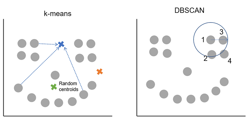
Remember from the k-means tutorial that it works by picking random starting cluster centres and then finds the points closest to them. The cluster centres are then recalculated as the average of the points in the cluster. The process of finding which points are nearest this new centre, assigning them, updating the cluster centre and then finding which points are now closest continues iteratively until a stable solution is found. As k-means likes to find circular clusters and assigns all points to a cluster, that's how we end up with roughly evenly sized clusters across our data. We told k-means we wanted 3 clusters and it found 3, they weren't quite what we had in mind.
DBSCAN on the other hand works by finding an initial core point and then exploring the epsilon radius around it. The arrow in the picture shows the size of epsilon which is something we'd have had to decide on in advance before calling DBSCAN. Let's say we also pass it the condition of minimum points = 3.
What happens then is that an initial point is picked, DBSCAN counts how many other points are within the epsilon radius and in our case there are 3 so the minimum points threshold is met. This means the starting point is a core point and will be assigned to a cluster. DBSCAN then works its way along, using the other points in the cluster and their epsilon radiuses to find all the other points that belong to the cluster. At some point either all the core points in the area will be assigned to the cluster or DBSCAN will have started to encounter border points. Once all the core points and border points for the cluster are found, it jumps to a different, unclassified point and starts the process again. We can see how this works (and compare it to k-means distance-to-centroid approach in the plot below):
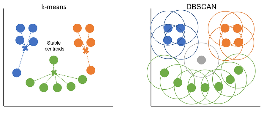
The orange and blue clusters are made up entirely of core points as they each have 3+ points in their radiuses. The points at either end of the green smile are border points as they only cover 2 points each (including themselves). Border points get assigned to the cluster of the core point they sit within the epsilon distance of but they can't be used to extend the cluster further. Any points that don't sit with the radius of a core point (the 'nose' in this example) are classed as outliers.
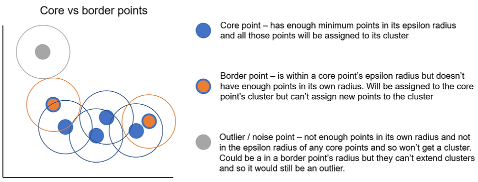
To try and highlight the difference between core and border points a bit more, I've coloured them slightly differently in the plot below. The outline of the point denotes which cluster it belongs to (either blue or grey) and the colour in the middle identifies whether the point is a core point, border or outlier point. The completely blue points are core points as they meet the minimum points requirement (min_samples = 3 in this example) and so any other points in their epsilon radius will be assigned to their cluster. The border points are on either end of the cluster and have orange centres. They get their cluster from the core point but don't have enough points of their own. The important difference between core points and border points is that only core points can extend a cluster i.e. assign observations inside their radius to a cluster.
For some reason the idea of repeatedly putting circle around data points always makes me think of the rings you get from a coffee cup. In this analogy the value of epsilon i.e. the value that decides how big we draw our circle would correspond to the size of the coffee we ordered. A big coffee or value of epsilon means we have a bigger circle around each point in which to look for other data points i.e. the value of epsilon sets the size of the search area. If we find enough other data points (i.e. if the space is dense enough in the search radius) then that point is deemed a core point and all other points in that radius will be assigned to its cluster.

The second hyperparameter that determines whether a point is a core point or not, is the minimum points value. Whereas epsilon tells DBSCAN how big of an area to search, minimum points tells DBSCAN how many points it needs to find for an observation to count as a core point.

The picture above compares picking different values of epsilon for the same data with the same minimum points criteria (5). On the left we pick a bigger epsilon value and so search a larger area which has 5 points in it. Since we set minimum points = 5 this would mean the point in red would be deemed a core point and so form a cluster and all the other points in its radius would be assigned to that cluster. On the right we have a smaller epsilon value where we don't meet the minimum points criteria so this point will either be a border point (if it sits within some other core point's epsilon radius) or an outlier point.
Hopefully this helps to show how the different combinations of epsilon and minimum points work together to help DBSCAN identify core, border and outlier points. A higher minimum points value means we need more observations within the epsilon radius for it to count as a core point. How achievable this is will depend on how dense our data is, how much data there is and also the value of epsilon we pick. Picking the right value of epsilon can be tricky as the plots below demonstrate:

If we pick too big a value for epsilon, we risk all our points ending up in the same cluster. If we pick too small a value, we risk flagging lots of cases as outliers as they won't have a wide enough reach to find other points. We'll see some ways of picking sensible values for epsilon later on but in general its preferable to err on the side of smaller values of epsilon to start with.
Finally, we saw in the list of watch outs that DBSCAN can struggle when the data has different underlying densities. As epsilon is a fixed value, what can sometimes happen when we have varying densities across our data is that it works well for one group but not the other. The plot below demonstrates this:
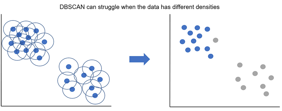
Although we can clearly see we've got 2 clusters, one is more densely distributed than the other. In this example our value of epsilon works well for the top left cluster but is too small to capture the less dense data points in the bottom right cluster.
Credit card fraud data from kaggle
Now we've covered how DBSCAN works, let's have a look at the data we'll be using. It's the credit card fraud data set from kaggle and contains individual credit card transactions over 2 days. It's got 284k rows of data of which only 492 are fraudulent. At the start we said DBSCAN is an unsupervised machine learning algorithm so what are we doing using labelled data? We're not actually going to use the labels to create the clusters. Rather, the hope is that fraudulent transactions will be examples of extreme or unusual activity e.g. single large purchases, transactions at strange times of day or made overseas and the plan is to cluster the data with DBSCAN to find and flag any outliers and then see if these are indeed more likely to be fraudulent.
Normally for any clustering project that involves calculating distances we'd want to pre-process our data by imputing/filling in any missing data as well as transforming and scaling it. The credit card data from kaggle already comes pre-processed for us and has had principal component analysis applied to it. If you'd like to learn more about the data prep steps for clustering there's a section on it in the k-means tutorial here.
As mentioned at the start, DBSCAN can be slower compared to something like k-means so to make everything run a bit quicker, we'll only keep a smaller sample of the non-fraudulent transactions. Reducing the size of the more common class in the data for a classification problem is known as undersampling.
Often undersampling is done to help with very class-imbalanced data (like ours). For example, if we we're building a classification model it could score an accuracy of 99%+ just from predicting every transaction to not be fraud (as over 99% of them aren't fraud). The idea behind undersampling is to try and make the class distributions more balanced and so make the model actually work for its accuracy score by learning the differences between the classes.
As it's the fraudulent transactions we're interested in and there aren't many of them, when we undersample we want to keep all of them. Conversely we have loads of non-fraudulent data so the extra information contained in any additional observation past a certain point is likely to be limited. As long as we take a big enough and representative sample of the non-fraud data we can still get our algorithm to learn the differences between the classes without having to use all of the data which would slow it down and tempt it to just predict everything as not-fraud.
In our case we're only undersampling to make our clustering run faster, rather than deal with any class imbalances so let's preserve the high class imbalance of the original data. We'll keep all of the 492 fraud cases and randomly take 100x that for the number of non-fraud cases. This gives us a <1% fraud rate in our new data. If we had more information on what was in the data we could potentially also perform stratified sampling to preserve the distribution of the data for any important features. Let's go ahead and load our data and create our sample:
To an add an extra challenge, let's say we're working with the credit card company to try and improve their fraud detection rate. Whenever a transactions gets flagged as suspicious let's pretend it's someone's job to phone the user and confirm whether the transaction is legitimate or not. Let's say this costs on average £5 per check.
What about the cost of fraud? We've actually got the value saved as 'Amount' which tells us how much each transaction was for. Let's sum this for all the fraud cases and also get an average value:
So the total cost of fraud is over £60k (in just 2 days!) with an average value of about £122 per fraudulent transaction. The problem is that as fraud is so rare (<1%) the actual cost of fraud per transaction overall is £1.21. Since it costs £5 to check a transaction we're going to struggle to do it profitably i.e. we spend £5 to on average save £1.21 from fraud.
Can we be a bit more targeted with our checks by only going after the larger transactions? For example, if we know it's £5 to check a transaction, one way to save money (but risk encouraging more fraud) would be to never check a transaction for <£5. Is there a threshold at which checking all of the transactions becomes viable? Let's group the transaction sizes into quintiles to see if there's a point at which it becomes profitable to check all the transactions:
We can see that the top 20% highest value transactions (£99.92+) have a positive pay back with an average fraud cost of just over £5.60. With a bit of rounding, we could create a rule to check every transaction that's £100+, we'd be spending £5 on each check but preventing fraud worth on average £5.61 so coming out ahead. Obviously by restricting ourselves to checking only some transactions there's a cost for all the missed fraud. We can calculate this cost too and also compute some standard classification metrics to see how our rules-based thresholds work:
With our £100 threshold for checking transactions, we'd check just under 10k in total and uncover 130 instances of fraud. Looking at the precision score (frauds / everything we flag to check) we're only just above the ~1% rate that we'd have from just checking stuff at random. We can see this as our 'lift' is only 1.3 i.e. we're finding fraud 30% more often than by checking at random but it's not a huge improvement. We can see that also from our recall score (fraud spotted / all fraud) that we're only capturing about 26% of all the fraud that takes place so we're still missing nearly three quarters of it.
The 'true_cost' column measures either the cost of the missed fraud or the cost of doing the checks. It sums to around £56k which is a bit less than the previous total fraud cost of £60k but doesn't represent much of a saving. As the £100+ rule isn't much better at spotting fraud than just picking transactions at random, it looks like the saving comes from spotting the highest value instances of fraud rather than because this approach is good at spotting fraud in general. Hopefully with DBSCAN we can do better. Before we start lets have a quick look at the rest of our data:
We can see we've got just under 50k cases to work with and we can see the data is pretty unintelligible after having had principal component analysis applied to it. I'm going to assume the order of the features represents the order of the principal components so the first two should capture the most variation in the data. Let's plot the data to see how it looks using them:

So it looks like the bulk of the data is contained in a big blob and then there are quite a few outliers. Hopefully a lot of the fraudulent transactions are in the outliers! I've resisted the temptation to colour the points by whether they are fraud or not to better mimic how we'd be working with this data out in the wild. Since our data has kindly been pre-processed for us we can jump straight into picking our parameters for DBSCAN.
Picking values for minimum points and epsilon
As discussed at the start, DBSCAN has two hyperparameters that we need to pick before we run our clusters. These are the minimum points (min_samples in the sklearn package) and the distance value epsilon (eps). Technically, there is a third hyperparameter where we specify what type of distance measure we'd like to use e.g. Manhattan, euclidean, etc. but for this tutorial we'll stick with default euclidean distance. There are a couple of rules of thumb that already exist for picking the minimum points hyperparameter so we'll start with that one first.
The minimum points is essentially the minimum cluster size that we'd be happy with. A general rule of thumb is that the lowest we'd want to go is 'the number of features + 1'. It's also worth noting that if we were to go any lower than 3, we're not really doing density based clustering any more as any point and its neighbour will have a min_samples = 2.
In our case we have 28 principal components so we'd want at least 29 minimum points. For data where we don't have any subject matter expertise using 2x the number of features can be a good starting point too. For us that'd be a minimum points value of 56. For larger data sets or ones that are known to be noisy we can use an even larger number of minimum points.
Picking a good value for epsilon is a bit harder but thankfully there are some helper functions we can use. Epsilon sets the maximum threshold for distance allowed between two points for them to still be considered neighbours. We can use the NearestNeighbors() function from sklearn to calculate the distance for each observation in our data to its 'k' nearest other points in our data. We can then use this to see for all our points what the usual/most common distance is between a point and its k-neighbours. This in turn can help us pick a sensible value of epsilon. The idea is we want to pick a value of epsilon that covers the majority of our data points but wouldn't be big enough to include any outliers into a cluster.
To use the NearestNeighbors() function we simply pass it the data we're planning on passing to DBSCAN i.e. pre-processed data not including any extra columns we've made along the way. When doing this in R the documentation for knndist() suggested we set the 'k =' option to be our min_samples-1 so let's do that here. This makes sense as if min_samples is the minimum size of the cluster, we want to calculate distances between '1 data point + all other neighbours in the cluster' which means we want a value of 'k= cluster size -1'. Since we're using min_samples = 56 for DBSCAN, we pass k = 55:
The output gets truncated as it's essentially a print out for every observation in our data, what the distance to its nearest k-neighbours is. The usual way to pick a value for epsilon is to plot the results and pick a threshold for epsilon that crosses just before the distance value jump massively in the tail.
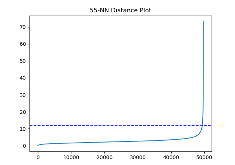
It looks like a value of 12, shown by the blue dashed line, would do a good job of capturing most of our data points before we start getting into the much further apart outliers. It does include a little bit of the tail though so we might want to pick a smaller value. A good double check on our plot is to also just calculate some percentiles on our distance data. For example, we can see what percentage of observations have a distance lower than X in our data:
So this tells us that 99% of our observations have an average distance of ~10 or under to their neighbours. Maybe our value of 12 was a bit high. In general, we want to err on having smaller values of epsilon rather than larger ones. Smaller values mean more points might go unclassified which isn't necessarily a bad thing for us given we're particularly interested in finding outliers in our data. Let's go conservative and pick a value of 5 for now and we can always try some different value of both min_samples and epsilon to see how it changes things.
Creating our clusters with DBSCAN
Just to recap, we'll have already pre-processed our data before now and then used it to help pick initial value of min_samples and epsilon. Now we're ready to create our clusters. We'll use the dbscan() function from sklearn. We pass it our data (excluding the non-PCA columns) as well as our initial values for epsilon 'eps=5' and minimum points 'min_samples =56':
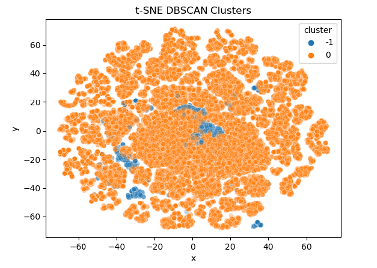
From the print out we can see the number of observations that went into our clusters as well as our chosen value of epsilon and min_samples . It looks like DBSCAN has decided there is only 1 cluster in the data and has classed 1,629 observations as noise/outliers. Normally one big cluster might suggest our value of epsilon is too large and lots of little clusters could be sign we need to pick a larger min_samples value but without knowing more about the original data it's hard to say for sure.
For example, the bulk of the transactions might be very similar day-to-day spending behaviours and so it's correct that they all sit together. The small clusters could then be different types of legitimate but large or unusual purchases e.g. buying a car, taking out foreign currency abroad, etc of which there wouldn't be many instances from just 2 days of data. Another approach to assessing the cluster solution that's covered in the k-means tutorial is to calculate the silhouette score for each observation and then average it across all observations. For now, let's plot the clusters using the first two principal components again to get a better idea of what's going on:

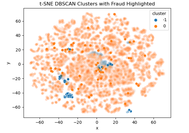
The points we saw earlier that all looked like outliers have all been left unclassified (shown in blue) which is promising. We can see that the bulk of the data points sit in the orange. Let's now have a look and see where our fraudulent transactions sit. This was actually quite tricky to plot as I wanted to try and keep as much of the original data as possible but also highlight the fraudulent transactions. As our data is very dense I ended up setting custom alpha (opacity) levels so that densely populated but non-fraudulent data still show up to add context but the bold colours will all be fraudulent transactions:

Comparing the two plots we can see that a lot of the fraudulent transactions were correctly left unclassified. It seems that outliers that score highly on "V2" are much more likely to be fraudulent. We can calculate the same summary statistics as before to see how well our DBSCAN did in flagging outlier transactions as fraud.
Those results look pretty good. We can see we'd flag just over 1.6k transactions for checking and uncover 413 instances of fraud. This gives us a precision rate of 25% for correctly identifying outliers as fraud. The lift of 25.6 means we're over twenty-five times better at spotting fraud than from chance alone! We also have a recall rate of over 83% meaning we captured over 4/5s of all fraud. We could even try different values of epsilon or min_samples to see if we can get this any higher.
Looking at the financials we'd have a cost of £13k from missed fraud and a £8.1k cost of checking all the outliers giving us a total cost of £21.1k. This compares well to the original £60k cost of fraud and even with the £100+ transaction rule the cost was still £58k. That represents a saving of about £40k for 2 days worth of transactions or ~£20k a day or £7.3m a year! Not bad at all. As a bonus for all our hard work, let's see how we can visualise our results in a nicer format to try and gain even more understanding into our data.
Visualising the clusters with t-SNE
The technique we'll try is called t-sne which is short for 't-distributed stochastic neighbor embedding'. This statQuest video does a great job of explaining how it works. Essentially, rather than find a transformation that best describes our data globally (like PCA), it instead looks to preserve local relationships so that when our data is projected into a lower dimensional space, the groupings from the higher dimensional space are preserved. Another benefit over something like PCA, is that it's a non-linear dimensionality reduction technique so it can preserve non-linear relationships between points which can help when visualising our data in fewer dimensions.
One thing to watch out for is that the way t-sne transforms the data isn't deterministic so we can end up with different solutions each time we run it (which is why I set a seed). This and the fact it focuses on keeping local relationships rather than global ones makes it unsuitable as an input into further machine learning algorithms but it works really well for visualising our data. There's also a hyperparameter called 'perplexity' that adjusts how our data gets grouped together. There's a great post on distill called 'How to Use t-SNE Effectively' that has some practical tips on getting the most out of t-sne and lets you play around with the perplexity parameter to see how it changes the plot with different types of data.
For our plots we'll be using the TSNE() function from sklearn. The t-SNE algorithm can be slow to run on large data with lots of dimensions so it's standard practice to run PCA on the data before passing it to t-SNE. We'd also want to scale it before we pass it to t-SNE. Since we've already had PCA applied which will have included scaling we don't need to worry about that.
As t-SNE focusses on keeping neighbours next to each other you can end up with some really interesting looking plots. Sometimes it can take a bit of time playing around with different value of perplexity to get something that looks useful. It's worth setting a seed as well as the random initialisation can mean you can get different plots each time you run it even if all the other parameters haven't changed. Feel free to have a play around with the perplexity or try a different seed value and see how it changes the results.
We can see there's a big band of red in the bottom left that are quite separate from the bulk of the observations. Let's try the alpha trick again to highlight the fraudulent transactions:
This view is quite revealing. There's a big, blue clump of fraudulent transactions in the bottom left and right that all got successfully flagged as outliers. If we had access to the original data it'd be interesting to see what type of transactions these are. We can also see that there are a lot of solid, orange dots peppered into the overall plot that shows these fraudulent transactions would be harder to spot. The group of fraud in the centre looks like it's 50:50 flagged as outliers and not so potentially we could improve detection by changing our values of epsilon.
Hopefully you've enjoyed this tutorial on DBSCAN and t-SNE. if you'd like to learn more about the data pre-processing steps that usually go into clustering you can find them in this k-means tutorial. If you'd like to see how you can clustering and visualise data hierarchically, have a look at this Yule's Q tutorial in here.