

How to build a segmentation with k-means clustering and PCA in Python with sklearn
In this tutorial you'll learn how to build a segmentation in Python using the k-means algorithm and use principal component analysis (PCA) to perform dimensionality reduction and help visualise our data. At the end we'll combine the results with a decision tree to convert the clusters into simple rule-based segments.

Contents
Unsupervised machine learning
In this tutorial we’re going to see how we can build a simple segmentation using the Instacart data from Kaggle. We’ll use k-means to build our clusters and principal component analysis (PCA) to perform dimensionality reduction and help visualise our data. Both k-means and PCA are types of unsupervised machine learning so it’s worth going into a bit of detail of what is meant by this.
'Unsupervised machine learning' means that the algorithm doesn’t have or use any pre-labelled data to work with. There’s no target column we're trying to predict like there would be in supervised machine learning. Unsupervised machine learning algorithms instead analyse our data to find interesting patterns. For example, k-means looks for collections of data points that sit closely together in the data space. PCA transforms our data to a new coordinate system and in doing so creates uncorrelated principal components where the first few principal components capture most of the variance in our data.

The data on the left is an example of unlabelled that we might pass to our k-means algorithm or perform PCA on. Although all the data points looks the same i.e. all 'blue circles', we can see that some points sit together whilst others are further apart. We can also see that there appears to be a weak, positive correlation in our data. Contrast this to the data on the right where we have labelled examples that shows our data splits into two classes i.e. 'blue circles' and 'red squares'. We could then train a model like a random forest or a logistic regression to take in these labelled data points and learn the differences between them.
One important distinction to note between unsupervised and supervised machine learning is that the lack of labelled data makes it much harder to measure how well our model is performing. As we don't have any labels for our data, we can't simply compute how many times we wrongly classified red squares as blue circles or vice versa. We'll look at a few different ways of measuring the performance of our clusters later on but often it comes down to what solution is the most useful or practical rather than having a specific accuracy metric that we're looking to optimise.
The k-means algorithm
To build our clusters we’ll be using k-means from sklearn but there’s a whole heap of clustering algorithms and the sklearn website has a nice visual summary of the main methods and how they work on different data types. If you’re interested in seeing some of the different algorithms in practice, the Yule’s Q tutorial makes use of hierarchical clustering to represent the associations between products in a category and the spotting credit card fraud tutorial makes use of the density-based algorithm DBSCAN. The k-means algorithm is a great general-purpose clustering algorithm. It’s got some potential pitfalls to be aware of but in general it’s quick and easy to work with which is why it remains so popular.
The ‘k’ in k-means represents the number of clusters we want it to find, which is a parameter we choose in advance and pass to the algorithm. It then works by taking our data and creating k-points at random and then working out for all the points in our data which are closest to each of the random k-points. It does this by measuring the distance in the data space between each of random k-points and every data point. By default it uses Euclidean distance i.e. straight-line distance.
Once every data point has been assigned its nearest k-point they’re classified as belonging to that cluster. The original, randomly chosen k-points are then updated and moved so they sit in the centre of their newly created clusters. Each cluster centre is referred to as a ‘centroid’ and is calculated from the average values of all the data points that sit in the cluster. This is where the ‘mean’ bit in k-means. We also record how far the new centre is from our previous one.
As we now have new k-cluster centres, we repeat the first step of finding all of the nearest points and assigning them to their nearest cluster centroid. Since we’ve moved the centre from our random initialisation this means some points will be closer to a different cluster centre now and these points will switch to their new, closest cluster centre. Once all the nearest points have been assigned we re-calculate our new cluster centres and record how far they’ve moved. This repeats iteratively until either we hit a set number of iterations (that we can specify in advance) or the results converge on a stable solution.
Below is an animation of the process from Wikipedia. Notice how at the start the points are mostly red or yellow but then the purple circles cluster grows quickly before the rate of change slows down in the last few iterations as the process arrives at a stable 3 cluster solution:
A 'stable solution' is identified by when we come to update our points at the end of an iteration, we see either no or very little movement i.e. each point is assigned to its closest centre and updating the centre no longer causes any points to move. There’s another great visualisation here that lets you walk-through each iteration in the clustering solution stabilises.
The main advantages of k-means working in this way are:
-
It’s relatively speedy even with big data (not to be underestimated)
-
Relatively simple to implement.
-
You will always get clusters at the end and they will always cover 100% of the data (although this can be a bad thing too!)
The main disadvantages tend to be:
-
We need to specify the number of clusters (k) to use rather than have it find the optimal number for us.
-
By using distance from a central point, k-means always tries to find spherical clusters. It responds poorly to elongated clusters, or manifolds with irregular shapes. This sklearn guide has a good review of the assumption k-means makes about our data.
-
As it uses the average distance among cluster member to calculate the centroid, this makes it sensitive to outliers/large values.
-
The random start points can have a large influence on the final solution and means the result can change every time we run it.
-
Given enough time, k-means will always converge/find clusters i.e. it’ll always run rather than flag that the output is no good or the data as unsuitable.
The list of downsides might look quite long but there are some steps we can take to mitigate some of the issues. As it’s relatively quick to run, we can try a range of different k values to see which leads to a better solution. We can also try running the whole process multiple times with different random start points and then just pick the best outcome. We can also attempt to remove or deal with outliers before running the clustering. The main disadvantage is that if our data has an unusual shape (this site shows what happens if we try running it on 'smiley face' type data) it might just not be appropriate for k-means. This also ties into the last point in the disadvantages list that we’ll always get clusters but we can’t take it for granted that they’ll be any good!
In terms of measuring whether our clustering solution is any good there are a couple of methods we’ll look at. Essentially, they try to measure how compact/close together the observations in our clusters are or how well separated they are from other clusters around them. In reality though the ultimate test for any clustering or segmentation should be: is it useful? Often, you’ll have practical constraints such as not having too many clusters that people have trouble remembering them or avoiding having very small clusters that aren’t useful for further actions.
Defining the business case for our segmentation
As mentioned we're going to be using Instacart data to build our segmentation. Instacart allows users to order their grocery shopping from participating retailers and either pick it up or have it delivered. Let's pretend we've been approached by them to build a segmentation to help them classify customers based on how they shop and use the platform.
For example, whilst some customers buy a bit of everything, some customers only shop certain sections of the store which means they must be going elsewhere for these purchases. Instacart are keen that customers do their whole grocery shop on the platform and as such want a way of identifying 1) customers who are missing out sections of the store and 2) which sections they're missing out. They can then carry out research into why these users are not shopping the full range and potentially send them some offers to get them to cross-shop between categories a bit more.
Having a clear use case is important when doing unsupervised machine learning. Although there are some statistical measures and rules of thumb we can use when assessing our final clusters, what makes a “good” set of clusters will vary depending on the problem we’re trying to solve. Ultimately what should be guiding our analysis at all times is the question “is this useful?” This becomes a lot harder to do if we don’t know what the final clusters will be used for. With that in mind, let's go ahead and load the data and have a look at what categories we've got to work with:
We can see that we've got 21 categories in total with the most popular being 'produce' and 'dairy eggs' with over 190k users shopping them. The least popular category with ~12k users is 'bulk'. We've also got a couple of more obscure category names such as 'missing' and 'other' which we'll look at in a bit.
One challenge with identifying customers who don't shop the full range is we wouldn't normally expect every customer to shop all 21 categories e.g. we wouldn't expect someone to shop 'pets' unless they had a pet or we wouldn't want to say a vegetarian should be shopping 'meat seafood'. One way to approach this could be to group categories together into more broader categories that between them cover off the different shopping needs we'd expect nearly all customers to have when buying their groceries.
For example, if we think about where we keep groceries in the kitchen we've got fresh produce or things with short use by dates that we might keep in the fridge e.g. dairy, meat, vegetables, etc. We've then also got ambient or longer lasting products that go into cupboards e.g. canned goods, soft drinks, alcohol, etc. We've also got the freezer compartment and then we've got all the non-food items we might buy like laundry detergent, household cleaning products, etc. These categories are probably broad enough that if someone wasn't shopping them or wasn't shopping them much, we'd assume they must be buying those items elsewhere.
The next challenge is to work out what share of someone's orders should go to each category type. How do we define is someone is buying too much fresh products and not enough ambient? We could come up with some business rules using a mix of subject matter expertise and quartiles or averages to define some business rules and then tweak them iteratively until we're happy with the groups. There's nothing wrong with this approach but it can potentially introduce a bit of bias from the analyst e.g. my threshold for classifying someone as not buying many frozen products might be different to yours. The advantage of using k-means is that we can let it identify the clusters and thresholds for us. We'll even see at the end how we can use the clusters created by k-means to convert them back into these business rule type definitions.
Let's have a quick look at the 'other' and 'missing' categories as these don't easily fit into our new categories as outlined above:
They look like a bit of a random assortment of different products. Maybe they're newly launched and so not been tagged with a proper category yet? Working on the basis that going back with the insight that "this customer segment is missing items from the 'missing' or 'other' category" isn't especially helpful we can remove these items from our data set:
Now we've removed the uninformative categories from our data, we can go ahead and create our new more general categories. We'll create a dictionary that maps the individual categories to the broader ones. I've grouped the products into ambient, fresh, frozen and non-food based on looking at the sorts of products that are in each department and also on the Instacart website. There's maybe an argument to be made for having the 'babies' department in ambient as there's a lot of jars of baby food but equally there's lots of products such diapers.
At the moment our data is still at a 'user - order - product' level whereas we're more interested in general categorisation of users based on all of their purchases across all of their orders. We can aggregate the data up to a user level rather than an order level as although we might not expect a user to order non-food products every time they shop e.g. rarely do you need to buy laundry detergent every week, over the course of all their orders we'd at least expect to buy it some of the time. Let's aggregate the data up to user level and create some metrics we think will be useful for our clustering.
Since we're investigating whether or not users shop a wide range of products I'll count the unique number of products, aisles and departments a user has shopped as well as the number of orders they've placed and the average number of products they tend to purchase in an order. These will capture how often a customer shops and how broad an assortment they shop. Next I calculate what percentage each of the total items someone buys come from each of the main categories we created earlier.
I could have instead counted the number of products someone buys from each category but to an extent that's already captured by the total number of items a user buys. For example, if someone buys a lot of products in general they're probably likely to also buy lots of products from each category. What we're interested in though is do customers buy a mix of products from each category i.e. a balanced split of products across the categories rather than just do they buy a lot from each category.
We can see from the print out above for example how user 1 didn't buy any frozen products despite placing 10 orders. Now we've got our data aggregated we can call a quick describe() on it to see how the different distributions within the data:
We can see that the fewest orders a customer has is 3 and the maximum is 99. Likewise some customers have only ever shopped one aisle whereas others have managed to shop over 100! We can see as well the average percentage of items bought from 'fresh' is over 50% suggesting that it's a popular or large areas of the store. By comparison 'nonfood' and 'frozen' are pretty small categories and yet there are still customers who managed to order 100% frozen items. We'll look at how we can deal with these extreme examples in the next section.
Data prep: missing values, correlations, outlier removal and scaling
Missing data
Now we've aggregated our data let's have a quick check for any missing values. Like a lot of machine learning algorithms, k-means will error if it encounters missing data. Let's confirm we've not got any missing data in our example:
Nice! If we did have some missing data, a simple option is to replace any missing values with the average value of the column. We can do this with the SimpleImputer function from sklearn. If you'd like to learn more about pre-processing data with sklearn there's a separate tutorial on it here. For our purposes we can define SimpleImputer(startegy='mean') which means it'll replace any missing values with the column average. We then use fit_transofrm() to apply it to our data (without overwriting the original in this instance as we didn't have any missing values). If using the average of the column seems a bit simplistic, sklearn has a number of different imputation options.
Correlated variables
Now we've removed any missing data it's a good idea to have a look at the correlations between our inputs. If we’ve got any highly correlated features we might consider removing some of them. This is because they’re essentially doing a similar job in terms of what they’re measuring and can potentially overweight that factor when k-means comes to calculate distances. It’s not a definitive requirement and we can always experiment with running the clustering with any highly correlated features included and removed.
The highest correlation we have is between ‘number of aisles’ and ‘number of departments’ at 0.89. Since aisles ladder up into departments it maybe makes sense to remove one of them. Since we’re trying to capture how much of the assortment people are shopping with these two features let’s keep number of aisles as it has a higher ceiling in terms of how many people can shop.
Outliers
Next up we can deal with any outliers in our data. In the sklearn tutorial I cautioned against blindly removing outliers to try and boost a model score but for clustering I take a more laid-back approach. This again comes down to what do we want to use our clusters for eventually. Since we’re trying to find people who don’t shop the full assortment I’m less worried if we have some extreme users who buy nothing but cat food vs users who buy every product in the shop.
The treatment/decision we’d apply to those users will be exactly the same as someone with more moderate behaviour i.e. they’d both sit in a “doesn’t buy much” or “buys loads” cluster even if their own behaviour is extreme within the cluster. As their extreme behaviour doesn’t change how I’d want to classify them but can potentially interfere with where the cluster centroids end up, I’m happy capping/removing any extremes in the distribution to help k-means create sensible clusters. For this tutorial I’m simply going to cap any values at the 1st and 99th percentile for each input.
We can see how the min/max values for a lot of the columns change with the removal of the outliers but in general the mean values show little change. For example, the average number of 'products_per_basket' is now 9.87 whereas before it was 9.95. However the largest number of 'products_per_basket' previously was 70 and now it's a much more reasonable 28.
Scaling/standardising and transforming
Another important step in clustering is to standardise the features so that they’re all on the same scale. As clustering uses a notion of ‘distance’ to work out what observations are close to others it makes sense that each feature it uses to calculate this distance needs to be comparable. For example, say we have a percentage value that ranges from 0 to 1 but also a spend value that ranges from £100 to £10,000. If left in their raw form the algorithm would potentially see the highest spend value as being 10,000 further away than someone with the maximum percent value.
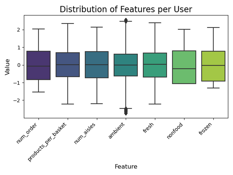
If we create boxplots of each of our features as they currently are we can see how the ‘num_aisles’, ‘num_order’ and ‘products_per_basket’ dominate the distribution as these are integer values compared to all our category data which can only be between 0 and 1:

A common way to rescale our data so they all contribute equally, is to standardise each of the inputs by subtracting the mean and dividing by the standard deviation so that all the input variables have a mean of 0 and a standard deviation of 1. This is what sklearn's StandardScaler() does. This way all the features contribute in an equally weighted manner when k-means tries to work out the distances between observations.
Another option is combine the normalisation with a transformation of the data to try and give it a more ‘normal’ shape. For example, we could use a power transformation like Box-Cox or Yeo-Johnson to try and give our data a bit more of a normal shape before scaling. The sklearn package contains options for both types of scaling which we can apply to our data and then plot to confirm each feature is now on a similar scale.
Reduce dimensions with Principal Component Analysis
Principal component analysis is a useful tool for reducing down the number of dimensions in our data whilst preserving as much information as possible. A handy benefit is that the principal components we create are also uncorrelated with each other. We’ll first see how PCA works and then how we can use it on our data.
There’s a great StatQuest here that will do a better job than me explaining the technical side of how PCA works and there’s a great 3Blue1Brown video on the linear algebra behind it here. There's also this site which has an interactive visualisation of how PCA works and let’s you play around with the data points and see how it changes the principal components.
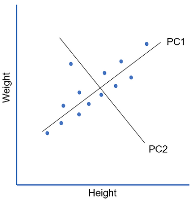
Essentially what we’re doing with PCA is replacing our original features with new principal components that are linear combinations of the original features. That phrase ‘linear combination of features’ might sound familiar if you’ve done linear regression before but whereas linear regression is a supervised machine learning technique, PCA is unsupervised. Instead of trying to predict a target ‘y’, what we’re trying to do is explain the variance that we see in our data. We can get an idea of how it does this from the chart below. To keep things simple I’ll just use some made up data with 2 dimensions - height and weight:

We can see from our chart that there’s a strong linear relationship between the two dimensions. We can also see that the data is more spread out along the ‘height’ dimension than it is the ‘weight’ dimension. We have some data points that are relatively short in height and some that are a lot taller. For weight there’s a bit of a spread but not too much. So how could we go about summarising the information contained in our data set?
Well, we could draw a line that captures the relationship we are seeing of the positive linear trend between height and weight and the fact that most of the spread in the data is occurring on the height axis. We fit it so that the orthogonal distance (distance measured at a right angle or 90 degrees from our line) between our data points and our line is minimised. Remember in PCA, we have no target we're trying to predict, rather we're trying to find lines that capture the information in our data.

This first line captures a lot of the information contained in our data. Our line can be expressed as a linear combination (just a weighted sum) of our height and weight dimensions. For example the line is a bit flatter so it might be something like 'PC1 = 0.9*Weight + 1.1*Height' and we see that it is a good approximation of our data i.e. it explains a lot of what is going on in our data. This line is our first principal component (PC1).
However we also see that some points sit above the line and some sit below. To capture this extra bit of information we can add a second principal component that captures the “above or below” aspect in our data. Looking at the spread when computing principal components is the reason why we need to standardise/scale our data before applying PCA to it. If we had dimensions with different scales then the dimension with the larger scale would automatically account for more of the spread in our data and so always become PC1.
To construct our second principal component we draw another line orthogonally (at 90 degrees) from our original line. This is what makes our principal components be uncorrelated with each other. This second principal component allows us to capture the information missed out by the first one but overall captures a much smaller proportion of the variance (because there isn't as much variation in this second dimension). As part of finding the principal components, the PCA process rotates our data so that the component that explains the largest variance in our data is on the horizontal axis and the second PC is on the vertical. It also centres the data so the mean is 0 so technically our data with the two principal components looks like the plot on the right:
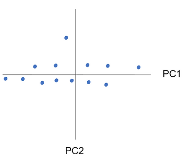
As PC1 gives us a good approximation of our data we might choose to not bother with PC2. This is how the dimensionality reduction aspect of PCA works. We only need to pick as many PCs that capture a ‘good enough’ view of our data. For example, if we chose to represent our data just with PC1 and essentially discard the PC2 component this is how it would look:

We can see that although we do lose some information about how our data is distributed we can still capture a lot of the information about which points are far away from each other and the general spread of our data. Sometimes our data will mean we need more principal components to explain all the variation in our data. For example, compare the plots below:


We can see on the first plot, PC1 captures most of the information i.e. it varies a lot on one dimension but only a little bit on the second dimension. The plot on the right however has a lot more variability on the second dimension so our first principal component, although still explaining the most, gives us a lot less. In the second example we might decide we want to keep the second PC and so we’ve not actually been able to reduce any dimensions.
Notice as well that what we’re capturing with our principal components is linear relationships in our data. If we had non-linear relations e.g. if our data made a circle on our scatter plot or was very wiggly our principal components would struggle a lot more to explain what was happening in the data.
At the moment we've been working with 2D data but the approach is exactly the same for however many dimensions we have. If we had more dimensions in our data we'd simply add more principal components to capture the variation seen in those new dimensions. Now, let's have a go at applying PCA to our data.
Since we’ve already standardised our data ready for clustering, we can go ahead and run PCA on it using the PCA() function from sklearn which also have a handy user guide on it here.
We can see that instead of our original features we've got 7 new ones - one principal component per original feature. The values printed out aren't particularly intelligible and usually we want to do PCA to reduce the number of columns not just create the same number of new ones!
The PCA() function actually has an option called 'n_components' where we can tell sklearn at the start how many principal components we want e.g. PCA(n_components=3) would only keep the first 3 components. We can also pass in a decimal value to tell sklearn to keep the number of components required to explain X% of the total variance e.g. PCA(n_components=0.95) would keep all the principal components until 95%+ of the total variance is explained by them.
Remember how the initial principal components are constructed in a way to capture more of the variance in the dataset? This means we can look at the individual as well as the cumulative total explained by the principal components to help us decide how many we might want to keep.
We can see that the first two principal components between them explain 57.6% of the variance in our data which is pretty good. By having just 3 principal components we can explain 73%! We can plot the totals to help us decide in our trade off between proportion of variance explained vs number of features:
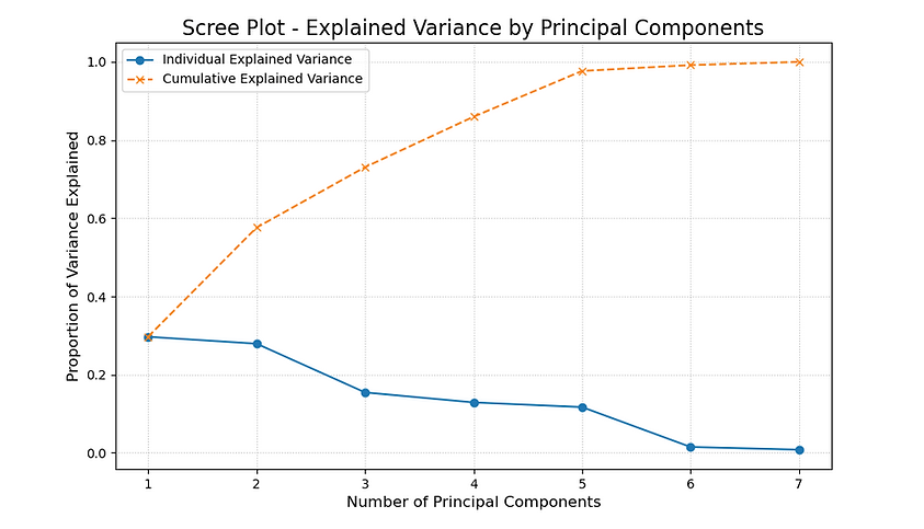
We can see very clearly from the orange line on the plot that we can get nearly 100% of the variance explained from just 5 components. If we wanted to be really parsimonious we could get close to 75% with just 3! To help choose, we can see the ‘loadings’ of our original variables on each of the principal components. This shows us the linear combination of features for each principal component i.e. how each feature in our data contributes to each principal component. We can plot PC1-3 to see which features contribute most heavily to each principal component to try and get an idea of what each one is representing from our data:

We can see that PC1 has a strong positive loading for 'num_aisles', 'product_per_basket', etc so looks to be an amalgamation of the the features representing how often and how broad users are shopping. PC2 has a strong, positive loading for 'fresh' and a strong, negative load for 'ambient' and 'nonfood' so it looks like it could be capturing our 'fresh only' customers. Finally, PC3 has a strong positive loading for 'frozen' but a strong negative loading for 'num_order'. This one's maybe a bit harder to interpret but we can definitely start to see how different behaviours e.g. primarily fresh/ambient/frozen shopping user behaviour can be represented by just the 3 principal components. Another neat application of PCA is to use it to visualise our data. For example, we can take just the first 2 principal components which capture about 57% of the variance and plot it:
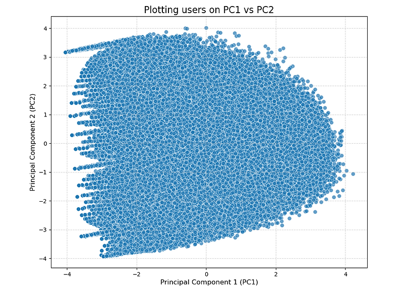
We can see that our data looks pretty blob like! This can be the challenge when working with real life data that a lot of the time, although we know there are different behaviours going on in our data, they’re not nicely separated into distinct groups. However, it’s our job to work with the messy data to determine sensible groups for the business to use.
Creating clusters with k-means
Let's have a go at creating our first group of clusters. To do this we'll use the KMeans() function from sklearn. I'm going to try a 5 cluster solution to start with. Generally you'll want to try a few different values of k and we'll see later how we can use some of the handy measures of fit that sklearn has to determine the optimal value.
There are a couple of options in the function it's worth mentioning. The most important is probably 'n_clusters' which is the number of clusters we want. The 'init' option tells sklearn how we want to create our starting centroids. For example, we could pick points at random but sometimes this can lead to bad solutions as we might get unlucky and have all our random points close together. By default, sklearn uses something called 'k-means++' which tries to make sure our starting points are more spread out. They have a comparison of how it compares vs picking points at random here.
The 'n_init' controls how many different starting point configurations we want to try for our clusters. By default 'k-means++' uses 1. The 'max_iter' controls for how many iterations we want the iterative process of assigning points and recalculating the centroids to run for. By default sklearn sets this to 300. Now, let's create our first clusters! We'll use the transformed and scaled version of our data and drop the 'user_id' column. We'll then print some summary stats on the clusters
It looks like we've got two smaller clusters ranging from 25k to 37k users each, a couple of medium clusters with around 41 to 42k users and one big one with 59k users. Depending on the data and what you're trying to achieve, very small clusters can sometimes be a sign that we've picked too large a value of k.
Looking at the average values of the different clusters across the features is useful. We can see that cluster 4 (the largest) has a much higher average number of orders, product per order and number of aisles shopped than all the other clusters. Cluster 2 have the second highest number of products per basket but have done the fewest shops on average. Clusters 0, 1 and 3 have all done a similar number orders (~10) but whereas cluster 1 has quite an even split of items across 'ambient' and 'fresh' with about 36% of their items coming from both categories, clusters 0 and 3 are almost opposites of each other. Cluster 0 has 76% of their items from the 'fresh' category and only 18% in ambient. Whereas cluster 3 have 63% in 'ambient' and only 28% in fresh - the lowest of all the clusters.
Already we can see some interesting behaviours across our groups. Cluster 0 looks to be getting mostly fresh items delivered so might be using the service to avoid having to go to the shops each week and save time. Cluster 1 buy quite a lot of non-food so might be using the service to get bulky or heavy items delivered. Cluster 2 have a similar purchasing profile to our highly valuable Cluster 4 customers but not as many shops - maybe they are new customers who go on to become very valuable? Cluster 3 do small, mainly ambient orders - could this be people getting last minute ingredients delivered?
We can do some more checks such as plotting the distribution of the features amongst the clusters rather than just looking at the average.
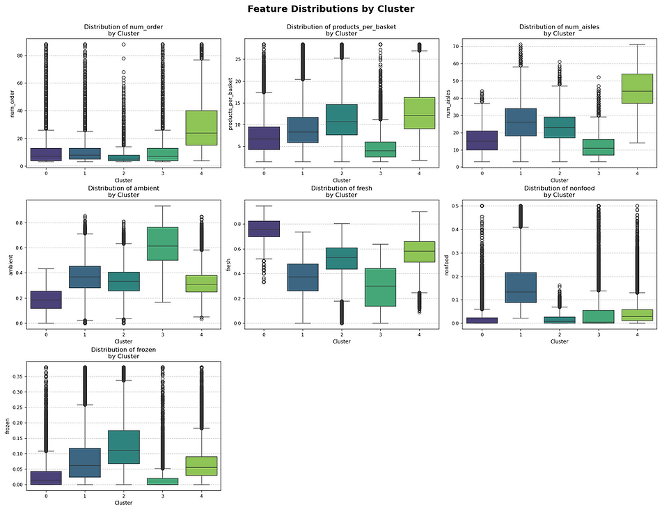
Similar to our interpretation of the cluster averages, we can see that cluster 0 is the 'fresh cluster', cluster 1 the 'nonfood cluster' and cluster 3 the 'ambient cluster'. Clusters 2 and 4 look to have very similar behaviours apart from the number of shops. Potentially we might want to try having more and fewer clusters and seeing how they change. We could just repeat the above process for different values of k but this is a bit time-consuming. Thankfully, sklearn also has a number of more scientific ways to determining what the 'ideal' number of clusters is.
Finding the best value of k for our k-means clustering
So far we've had a look at the 5 cluster solution which looked like it was doing a pretty good job of finding different user groups. Let's now try a few different values of k to see if we can find an even better solution. There are a couple of statistical methods to identify good clustering solutions which we'll run through now but the ultimate test should be whether or not the final solution will be useful and help us solve our business case.
The first method we'll look at uses the within-cluster sum of squares (WSS). This measures how closely the observations in each cluster sit towards the cluster centroid i.e. how compact each cluster is. Essentially for each point you work out the straight line distance between it and its cluster centre and square it and then sum this for all observations in the cluster. The idea behind clustering is to group similar data points together so we'd hope that each point in the cluster is similar to all the others and so similar to the average for the cluster i.e. the distance between each point and the cluster centre should be low. Sklearn actually stores the WSS of our solution in the _intertia attribute from our fitted cluster object.
Interpreting the WSS in isolation though can be tricky as a lot of the within cluster sum of squares size depends on how spread out our data is in general and also on its scale. One way to measure it is to compare the WSS between multiple solutions with different numbers of clusters. One thing to be aware of is that the total WSS value should decrease every time we add more clusters by virtue of the fact that having more, smaller clusters will make them more dense. This means it's not just a case of picking the solution with the lowest total WSS. Typically how we use the measure is to plot the total WSS for each cluster solution so we can track the decrease for each extra cluster. As a rule of thumb we can then pick the solution at the 'elbow' of the plot i.e. the last value of k before we see the decrease in total WSS start to tail off.
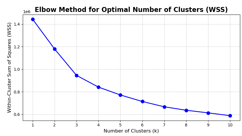
The plot is referred to as an 'elbow plot' as we're looking for the point where the increase in complexity of adding an extra cluster doesn't result in as much of a drop in total WSS as previous values of k. For our plot it's not super clear where the elbow point is! This can be one of the challenges when trying to cluster real world data. We can see that the total WSS drops quite quickly up to 3 clusters and then tails off a little bit. This might suggest exploring 3 clusters as another possible solution.
Another method for finding the best value of k is called the 'silhouette score'. The silhouette score compares how similar each data point is with all the other data points in its own cluster (mean intra-cluster distance) vs how similar the point is compared to all the data points in the next nearest other cluster (mean nearest-cluster distance). We can then take an average of all these scores to get an overall value for the clustering solution.
The average silhouette score can range from -1 to 1 and a higher value is better. The sklearn documentation has a good description of the exact calculation. If the clustering solution is good what we’d hope is that each point sits closely to other points in its cluster (good compactness) but also be far away from points in other clusters (good separation). The downside with this approach is because we need to calculate the distance for every data point against a lot of other data points (all points within the cluster and all points in the next nearest cluster) it can use a lot of memory so we'll run it on a sample.

Considering the maximum value we can get is 1, we can see that a lot of our scores are fairly low which means although our points are closer to their own cluster members which is what we want, they're also quite close to points in other clusters too. This is one of the challenges with working with behavioural data like we are in that there's probably fairly limited way in terms of how users can shop the site so all behaviours sit quite closely together. However, we can see that a 3 cluster solution has the highest overall score which matches what we saw with our elbow plot.
The above chart shows the average silhouette score for the clusters. We can also plot the individual result for each observation in the cluster. This can be useful as we'd hope that most of the points score highly and also the scores are fairly consistent within the clusters. If we have some points with low scores this suggests we've got close or overlapping clusters and a score<0 is a sign that the point might even be in the wrong cluster entirely.

We can see that the average silhouette score for the 3 cluster solution is 0.2 but actually, we've got quite a lot of points below this level. There are even some observations in cluster 1 and 0 that have scores <0 suggesting they are closer to the observation in another cluster rather than their own.
Picking a final value of k
From our WSS and silhouette plot, having 3 clusters looked like the best option. So does this mean we should pick 3 clusters and call it a day? Although the elbow plot and silhouette score are handy guides as to how dense or well separated our clusters are, ultimately we want to create something that adds value to the business. We might want to look at the size of the groups if we have more or fewer clusters and also what behaviours get merged or teased apart by plotting the distribution of behaviours.
Suppose we'd shown the results of our original 5 clusters with our stakeholders but after speaking to them, 5 clusters were more than they were expecting and maybe there's a requirement that each clusters needs to be of a minimum size to be useful. Let's try going with our 3 clusters and hope that they're all of a good size and capture distinct customer behaviours.
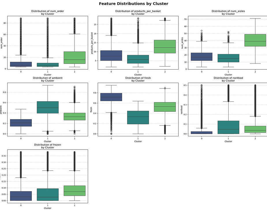
We can see that the clusters are all a decent size ranging from ~50k, ~60k and ~90k. It looks like Cluster 2 is the new 'shops a lot, buys lots of products across lots of aisles' cluster which is good news for Instacart as they're also the largest! Cluster 0 and 1 are interesting in that they both have a similar number of orders, items per order and aisles shopped. Their main difference comes from how they shop across the categories. Cluster 0 have over 70% of their items from the Fresh category whereas Cluster 1 have 51% Ambient and 9% Non-food. Both buy a similar amount of Frozen.
This suggests there are two separate groups of behaviour going on in our smaller clusters. Cluster 0 are potentially buying their ambient and non-food goods elsewhere. These categories can sometimes be a bit more functional and easier to shop around for e.g. it's much easier to compare the price difference between retailers for the same pack of branded dishwasher tablets than it is say the freshness or quality of a steak. Cluster 1 are almost the opposite of Cluster 0 and don't buy much fresh produce but do buy more ambient and non-food. Potentially these could be customers using Instacart to buy bulky or heavy ambient goods as it's convenient but then they tend to buy their fresh produce elsewhere. It looks like we've met our brief to find pockets of customers who aren't shopping the whole assortment and identified the categories to target them with offers for to try and get them to shop more.
Earlier we saw how we could plot our data using the first two principal components. Now we can do the same but this time we can colour the points to match their cluster:
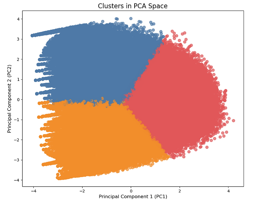
We can see we've succeeded in getting 3 fairly evenly sized clusters that each occupy distinct areas of our plot. We can see that each cluster shares a fairly messy boundary with the others which is probably why our silhouette score was so low. In an ideal world, we'd have nice, self contained groups but on the other hand the cluster profiles showed 3 fairly distinct, interpretable and useful patterns of behaviours that met our business case.
As a business we'll always need ways to categorise customers and treat them differently even if their behaviours aren't as discrete as we'd like. For example, a customer spending £1,000 a year might be classed a VIP customer whereas the one spending £999 wouldn't even though there's only £1 i.e. not much distance in it.
Running k-means after PCA
As well as using PCA to help visualise our clusters we can also use the principal components as inputs into the clustering. This can sometimes be an advantage as we can use fewer features and possibly remove some of the noise from the original data. We saw earlier that we only needed 3 principal components to capture over 70% of the variance in our data so we can try clustering just using those. Let’s reuse our 3 cluster solution code but pass it the PCA data set this time:
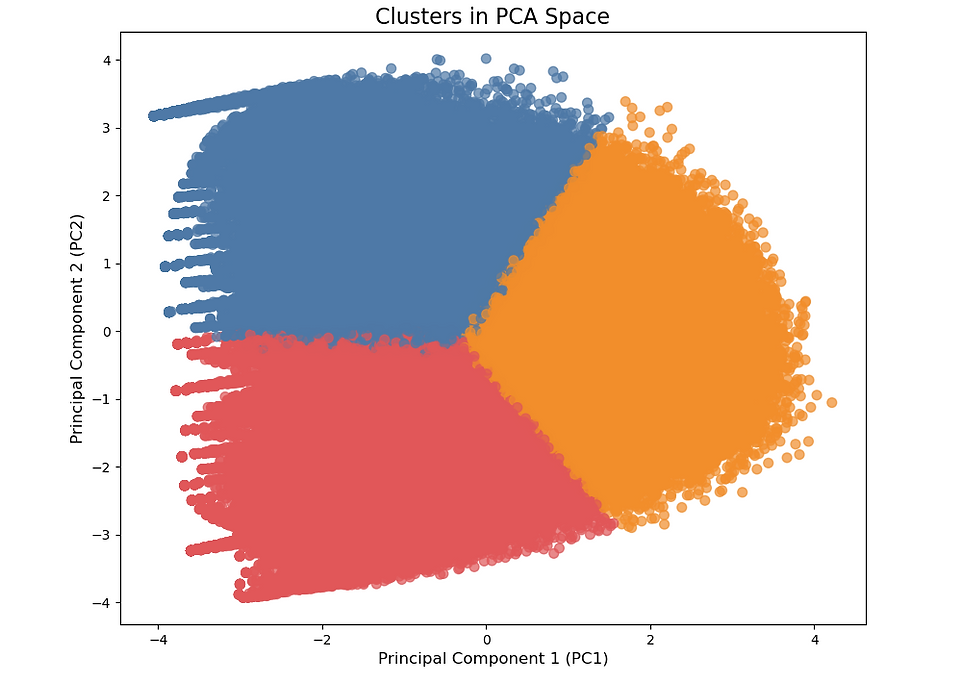
The clusters look very similar to our original ones on the raw data which is reassuring! The main difference seems to be the orange and red swapping location which is just down to the cluster number assignment not being fixed between runs. It looks like they converged into the same groups as on our raw data though. Let's check this to see how well the two different solutions match after we match up the cluster numbers:
Looks like >98% of all our original observations end up in the same cluster whether we use our original data or just the first three principal components. In this case I’d probably choose to present the non-PCA solution back to the business as it’s a lot easier to answer the question of what went into the clusters if we have the original features.
Convert clusters to business rules using a decision tree
Finally let's try using a decision tree to translate our clusters into an even easier to understand set of business rules. The decision tree will take in our original, untransformed features and try to predict which cluster each user belongs to. We're essentially using the decision tree to solve the classification problem 'what cluster is this user in given these features' to derive rules that best map users to their clusters using the original features.
This has the advantage of making our final segments easier to explain to stakeholders and also removes some of the ambiguity from users that sat of the edges of the clusters of which we know there are a few. We can use the DecisionTreeClassifier from sklearn which can handle multiclass predictions like this. We'll need to set some sort of max_depth or max_leaf_nodes to stop it from creating an overly complex model that perfectly fits our data.

We can see from the plot that we've got 4 sets of rules for grouping customers into their predicted cluster based on their behaviour e.g. each rule is a combination of the first split and then a second split to assign the clusters giving us 4 rules in total. We can use the export_text function from sklearn to make the rules a bit more intelligble before coding them up and seeing how our model performs.
So for our first rule set we can see that if a user has shopped <=27.5 aisles AND the percentage of their items bought that are Fresh is <=0.56 the model will assign them to Cluster 1. We can write out these rules to assign all our users to clusters and see how well they match our actual, clustered data:
Looks like our business rules match between 83-89% of our original clusters. We could potentially experiment with some different model parameters to try and improve accuracy or use cross-validation to get an idea of how generalisable our rules might be when faced with new data. The main advantage of translating the clusters into simple rules like these is we can easily assign any new customers to a segment. We've pretty much come full circle in terms of creating business rules to help identify our different groups. The benefit of doing it this way though is rather than iteratively testing lots of different rules and then applying them to our data, we let k-means find relevant groups in our data from which we derived the rules.
If you'd like to see some other types of clustering in action, this tutorial on Yule's Q uses the same Instacart data to find associations between different products. There's also this tutorial on how to use DBSCAN to spot credit card fraud.